"To push the boundaries, you need to know where the edges are." - Mark Boulton

Monday, October 22, 2012

Bathroom Design


This bathroom design is based off curved lines and waves. For being a smaller bathroom it still has an inviting feel. The private niche with the vanity inside is a curved feature that highlights the space. Adorn with polished chrome and white fixtures keeps the bathroom simple, but the reds, browns, and greys liven the bathroom with warm tones. 

The ceiling as reflective brown glass that will reflect the ceiling lights effectively and brighten the room up even more. The shower glass is patterned with white splashes to still provide a private area in the shower even though the material is not completely opaque. The waved red and brown tiles energize the bathroom as a back splash behind the vanity as well as a border around the walls. 

One would enter the bathroom from the corner which makes the bathroom feel larger in size and not so compact. The arched niche also gives a sense of space. The niches is accented with a round mirror as well as pendant lights for accent lighting on the vanity. There are sliding/rolling bottom shelves on the vanity that provide easy access for people as well as give a toe clearance. 

There are rounded grab bars around the toilet as well to support someone if needed. 


The bathroom had a lot of details to design but I found it easier to incorporate my ideas into the bathroom than the kitchen. After realizing what space I could utilize by placing fixtures and such where it became easier to incorporate all of the details with the design process.


Monday, October 8, 2012

Ride, Don't Walk


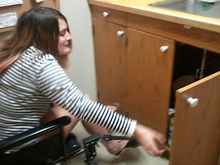
Perry went first and I observed that she had a hard time turning around in the bathroom stall as well as reaching for objects. 


Perry stated that rolling on carpet was very difficult as well. 


When I was in the wheel chair I could easily grab a magazine from the lower shelves but any higher I would not have been able to reach it. I didn't like that there was a handicap button on the middle of the ramp in Daggy because then you have to stop and put on your brakes and then push it. You also can't forget to leave  room for the door to swing open for you. Ramps are terrifying in wheel chairs. And it was impossible for me to use the restroom in Daggy. Not only could I not get through the entrance easily, the stall did not have a 5 foot turning radius for me to utilize the space. 

It is also very difficult for someone in a wheel chair to have to get through the door before the automatic door closes. I got shut between the door because I took too long to get back into Carpenter from the uphill ramp. Although, I did have a gentlemen hold the door open for me which was very nice and I appreciated it a lot. It makes one consider your manners in society. 


I could not even reach the "barista" to hand her by debit card to pay for a coffee at the Carp Cafe. When I went to reach for the "coffee" if was a little easier to grab but still difficult to have in your lap with your wallet, while trying to manuever the chair. 

Showrooms and Tours


We visited Knoll Textiles and got a tour of their showroom. I sketched their Tulip Collection by Eliel Sarinen. It appealed to me because it was simple and cute. I also got to see a lot different chair styles and methods to adjust to different types of people. 

The Space Needle in Seattle was very difficult for me to sketch. I had a hard time looking up and creating the right scale for the structure. It was also a challenge to draw the House of the Immediate Future by Habitat for Humanity at the bottom of the massive Space Needle. It is difficult for me to draw exterior perspectives so the outside of the house does not look like its supposed to. 


Urban Sketchers - Seattle


During the study tour in Seattle we went to the Sculpture Park with the Urban Sketchers. The sound waves sculptures was my stronger sketch. I used a lot of shadow and color to emphasize the art. My other sketch was off in scale. I made the sculpture too big but I still provided shade and other surroundings. 

Kitchen Design


 When transforming a hotel space into apartments it is essential to understand the residential needs of the occupants who will be leasing the space. After researching the meaning of home by analyzing a the poem Home Sweet Home by John Howard Payne, I came to realize the importance of branching out from home and exploring the world. It is okay to venture out because home is a solid foundation that will always be a place to come back to. I used this inspiration to create a concept of curved lines and variety. The paths people make while living their lives twist and turn but you can always follow the path from one point to an other. I used my curved-based concept model to express and soft curved kitchen area. By viewing the model in a profile I saw that the curve made loops which looked like semi-circles so I incorporated this shape with the counter tops and fixtures for seating and eating. There are also curved shelves on the refrigerator wall and curved drawers on the west side of the kitchen. Also on the side is a walk in pantry for extra food storage space. 

I also chose a semi-circular sink for the kitchen to follow the round fixtures at the bar as well as balancing the kitchen with the rounded edges.

At the bar area there is underneath storage as well for dishes or special china or whatever the occupants needs are.

The oven hood extends all the way to the ceiling with pillars outlining it all the way up as well for an emphasized range.

I decided to use dark stained bamboo strand flooring with white marble counter tops and dark black cabinetry. The back splash has a variety of brown and gray tiles but only go up half of the wall and the upper half would be a light cream colored paint called "cotton ball". Then there will be an opaque patterned resin material on the cabinet doors. With lights under the cabinets and one giant light fixture in the center of the kitchen the space will be lit up even with the dark color scheme. 

There are four rendered perspectives of how the space will be experienced if lived there. 

This is a volumetric model of how the kitchen and living space will correlate with each other. 

View from the hall walking toward the kitchen from the entrance of the apartment. 

View from the hall walking toward the kitchen from the bathroom.