As I was typing my client brief for the re-design of the St. Elmo's hotel I did not realize how many details went into the brief. Initially i thought of a client brief as just an overall summary about the design process but it is actually much more than that. It does summarize the process but it also allows someone to understand the amount of development that went into the concept and design for the project. From the beginning sketches to the circulation diagrams to the actual measurements all lead to a tangible result of what originally was just a vision.
This was my first time writing a client brief so I was not sure of everything that needed to be incorporated or documented but I did put in a lot of thought to what the client's envision was and how I guided the client to a design that will become part of his surroundings and his lifestyle. It was also good to see how I did or may not have overcame any design challenges for the project and how I could improve in that aspect in the future.
Friday, December 7, 2012
Residential Space
The residential space I developed is part of a redesign for a hotel to convert into apartment living. I focused mainly on the one bedroom apartment and the common space for the second floor of the project. The one bedroom is designed to have a private entrance and the initial view of some Lumicor screening on the entry closet door. As one turns into the living area, an individual can peer into the kitchen as well as viewing a peninsula for extra seating and eating space. The kitchen is supported a little by natural light as there is a window at the end of the counter but what really brightens up the kitchen is the dropped ceiling which has light fixtures that focus on the kitchen as well as the surrounding areas. There is also a dropped ceiling above the peninsula allowing one to study or eat comfortably. The living area is a smaller space but still provides the necessary components for a relaxing hang out environment.
As one moves away from the kitchen and living area you can see a staggered wall which echos the differing heights of the peninsula sitting adjacent to it. You can either choose to go right into the bedroom or left into the bathroom. The bathroom as a closet storage as well as a leveled vanity with an over the counter sink and a frontal reach for the toilet. There is one window in the bathroom near the toilet for ventilation and natural light.There is a pocket door which connects the bathroom and bedroom allowing more flexibility in the paths and traffic in the apartment.
The bedroom has a large closet and two windows for lots of natural lighting. There is also a little bit of a recessed ceiling in the bedroom for a dramatic light fixture to brighten up the space.

Model with one bedroom apartment floor plan.

First board showing my initial thoughts and process in designing the one bedroom apartment.

This board shows the common space which is filled with much warmer tones than the apartment to differentiate the environments and gives people the option on what kind of atmosphere they want to be surrounded in.

This board displays my kitchen and living area. There is a rendering of how the space is envisioned as well as how it can be utilized.

This board is of my bedroom and bath. Since they are connected by a pocket door I kept both spaces similar and cohesive with color scheme and earthy materials.
Monday, November 26, 2012
Meeting with a Practicing Designer
I met up with a local practicing designer in Gresham, Oregon. Her name is Sarah Martinez and she is a designer who works with Home Depot in the Kitchen and Bath Department. After showing her my plans of the St. Elmo's Hotel space I am working on we discussed overall layout of the one bedroom apartment as well as finer details such as materials. She helped me focus in more on my design concept as well as went over positioning of different fixtures in the bathroom like moving the toilet and shower to create more space for storage. She gave me ideas for dropping the ceiling of the space since I didn't want to keep it leveled at 10ft everywhere.
She also provided me with material samples for flooring and counter tops. She was thoughtful and helpful. It was a constructive visit as she liked some of my ideas and helped me evolve my initial design.
Monday, October 22, 2012
Bathroom Design

This bathroom design is based off curved lines and waves. For being a smaller bathroom it still has an inviting feel. The private niche with the vanity inside is a curved feature that highlights the space. Adorn with polished chrome and white fixtures keeps the bathroom simple, but the reds, browns, and greys liven the bathroom with warm tones.
The ceiling as reflective brown glass that will reflect the ceiling lights effectively and brighten the room up even more. The shower glass is patterned with white splashes to still provide a private area in the shower even though the material is not completely opaque. The waved red and brown tiles energize the bathroom as a back splash behind the vanity as well as a border around the walls.
One would enter the bathroom from the corner which makes the bathroom feel larger in size and not so compact. The arched niche also gives a sense of space. The niches is accented with a round mirror as well as pendant lights for accent lighting on the vanity. There are sliding/rolling bottom shelves on the vanity that provide easy access for people as well as give a toe clearance.
There are rounded grab bars around the toilet as well to support someone if needed.
The bathroom had a lot of details to design but I found it easier to incorporate my ideas into the bathroom than the kitchen. After realizing what space I could utilize by placing fixtures and such where it became easier to incorporate all of the details with the design process.


Monday, October 8, 2012
Ride, Don't Walk

Perry went first and I observed that she had a hard time turning around in the bathroom stall as well as reaching for objects.

Perry stated that rolling on carpet was very difficult as well.
When I was in the wheel chair I could easily grab a magazine from the lower shelves but any higher I would not have been able to reach it. I didn't like that there was a handicap button on the middle of the ramp in Daggy because then you have to stop and put on your brakes and then push it. You also can't forget to leave room for the door to swing open for you. Ramps are terrifying in wheel chairs. And it was impossible for me to use the restroom in Daggy. Not only could I not get through the entrance easily, the stall did not have a 5 foot turning radius for me to utilize the space.
It is also very difficult for someone in a wheel chair to have to get through the door before the automatic door closes. I got shut between the door because I took too long to get back into Carpenter from the uphill ramp. Although, I did have a gentlemen hold the door open for me which was very nice and I appreciated it a lot. It makes one consider your manners in society.

I could not even reach the "barista" to hand her by debit card to pay for a coffee at the Carp Cafe. When I went to reach for the "coffee" if was a little easier to grab but still difficult to have in your lap with your wallet, while trying to manuever the chair.
Showrooms and Tours


We visited Knoll Textiles and got a tour of their showroom. I sketched their Tulip Collection by Eliel Sarinen. It appealed to me because it was simple and cute. I also got to see a lot different chair styles and methods to adjust to different types of people.
The Space Needle in Seattle was very difficult for me to sketch. I had a hard time looking up and creating the right scale for the structure. It was also a challenge to draw the House of the Immediate Future by Habitat for Humanity at the bottom of the massive Space Needle. It is difficult for me to draw exterior perspectives so the outside of the house does not look like its supposed to.
Urban Sketchers - Seattle


During the study tour in Seattle we went to the Sculpture Park with the Urban Sketchers. The sound waves sculptures was my stronger sketch. I used a lot of shadow and color to emphasize the art. My other sketch was off in scale. I made the sculpture too big but I still provided shade and other surroundings.
Kitchen Design

When transforming a hotel space into apartments it is essential to understand the residential needs of the occupants who will be leasing the space. After researching the meaning of home by analyzing a the poem Home Sweet Home by John Howard Payne, I came to realize the importance of branching out from home and exploring the world. It is okay to venture out because home is a solid foundation that will always be a place to come back to. I used this inspiration to create a concept of curved lines and variety. The paths people make while living their lives twist and turn but you can always follow the path from one point to an other. I used my curved-based concept model to express and soft curved kitchen area. By viewing the model in a profile I saw that the curve made loops which looked like semi-circles so I incorporated this shape with the counter tops and fixtures for seating and eating. There are also curved shelves on the refrigerator wall and curved drawers on the west side of the kitchen. Also on the side is a walk in pantry for extra food storage space.
I also chose a semi-circular sink for the kitchen to follow the round fixtures at the bar as well as balancing the kitchen with the rounded edges.
At the bar area there is underneath storage as well for dishes or special china or whatever the occupants needs are.
The oven hood extends all the way to the ceiling with pillars outlining it all the way up as well for an emphasized range.
The oven hood extends all the way to the ceiling with pillars outlining it all the way up as well for an emphasized range.


I decided to use dark stained bamboo strand flooring with white marble counter tops and dark black cabinetry. The back splash has a variety of brown and gray tiles but only go up half of the wall and the upper half would be a light cream colored paint called "cotton ball". Then there will be an opaque patterned resin material on the cabinet doors. With lights under the cabinets and one giant light fixture in the center of the kitchen the space will be lit up even with the dark color scheme.

There are four rendered perspectives of how the space will be experienced if lived there.

This is a volumetric model of how the kitchen and living space will correlate with each other.

View from the hall walking toward the kitchen from the entrance of the apartment.

View from the hall walking toward the kitchen from the bathroom.
Tuesday, September 11, 2012
Concept Model of Home
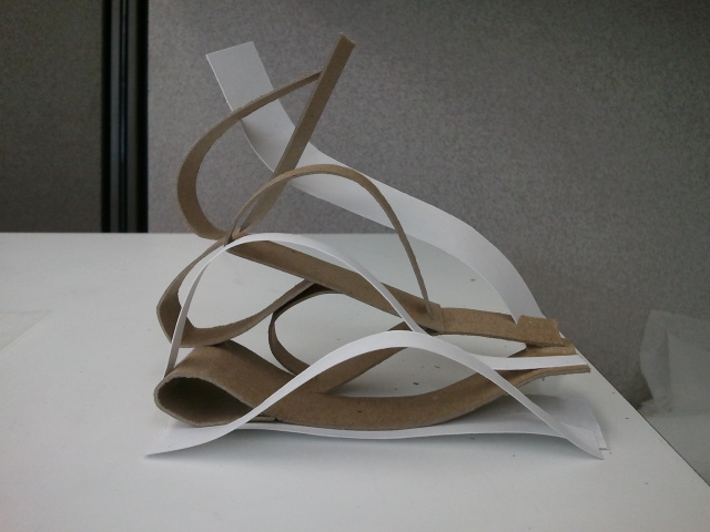
Home is about branching out and taking your own path in life. The paths may twist and turn but you always have home to go back to. To represent this I used one piece of chipboard and cut it into slits and bent and curved the strips to form a shape. The paths come from one place just like a person comes from one home but can end up in a completely different location.
Friday, September 7, 2012
Multi-generational Living Case Study

I focused on the growth and expansion of multi-generational living. By focusing on monolithic dome residences I discovered reasons behind multi-generational homes. The Yuma Dome, in Yuma, Arizona is a dome structure that serves four generations of a family simultaneously. It's 11,000 sq ft of living space provides cost-effective and energy efficient space. There are eight suites total in this specific home. The family living here worked together on the Yuma Dome and have successfully and comfortably lived together. Multi-generational living is becoming more and more popular; especially due to the economic crisis that has surrounded our generation.
Thursday, July 26, 2012
Sketch Reflection

Here is a little bit of free handed drafting to describe my experience while learning how to draw perspectives and contours and the many other methods I need to practice to become a successful designer. I don't free hand very often so my hand was shaking when I was producing the strokes but over all I just need to stay consistent to make it look uniform.
"A Skewed Alternative"


Here are the final posters related to my work focusing on creating a 3-D space from a 2-D abstraction. The hand-crafted posters display my object of inspiration that I took an element from and expanded it to a structure with a purpose of sheltering and seating people. Studying how people would interact with the space gave me a good understanding of how to arrange and organize my design ideas. I found it difficult to portray my process and ideas on posters but I managed to display an adequate amount of information to get the concept across. Using an architect and found object to base my design on was interesting. I got to see how unrelated subjects can be connected and morphed into a brand new idea. I was striving to create a more organic shape to my design but ended up going in the opposite direction with geometric patterns. Sometimes things don't go as planned when designing but that opens up new paths to something never thought of. I am happy with the contrasted design that I resulted with and am glad I can pull out many elements and principles along the process to the end.
Friday, July 20, 2012
Final Seat and Shelter Model


Here are some different angles of my final model that will act as a seat and shelter. The design was based off of my found object (a pine cone) and inspired from the designer I researched (Richard Meier). I used chipboard and acrylic in my model. I played with value, diagonal lines, geometric shape, and repetition to create an effective space to occupy.
Concept Model

This is the concept model I produced from my 2-D abstraction process and other refined study models. It is based off of a pine cone. This 3-D model will guide me to designing an actual space people can occupy.
Three Refined Study Models

Here are the three refined study models I created from my first bunch of models. The three were based off of certain characteristics I wanted to emphasis spatially. From these models I will focus on a concept to expand my design and gradually create a structure that can be used.
Thursday, July 19, 2012
An Other Two Point Perspective

Here is an other sketch using two point perspective. This time I practiced using an exterior view rather than an interior one. I feel that I am gradually getting better at understanding how the human eye recognizes space and it is becoming easier to quickly draw such a perspective.
Two Point Corner

I am working on drawing in a two point perspective right now. I find two point a bit easier to understand that the one point. I have had more successful sketches using this method. Here is an interior corner of a building on campus to display my practice using two point perspective.
Friday, July 13, 2012
Exterior One Point Perspective

I have been working on my perspective drawings lately. This is a one point perspective sketch of one of our engineering buildings on campus. I have difficulty drawing perspectives so I have been paying close attention to my horizon line and vanishing point. The left wall of the building was the most challenging for me since it is the part of the drawing that is in most perspective. The windows started out looking warped but I managed to make the lines more vertical to match the corner to make it look more realistic.
Tuesday, July 10, 2012
Abstraction Study Models

I created some study models based on my abstractions that I sketched and posted earlier to this blog. I went from the 2 dimensional sketches to these 3 dimensional models. Using the concepts I based my models on I will now refine my ideas to constructing a structural element that can be used by individuals.
Monday, July 9, 2012
Hybrid Drawing


I used photoshop to create a perspective sketch. Here are the grayscale and color versions of my room that I created.
Friday, July 6, 2012
Chair Perspective
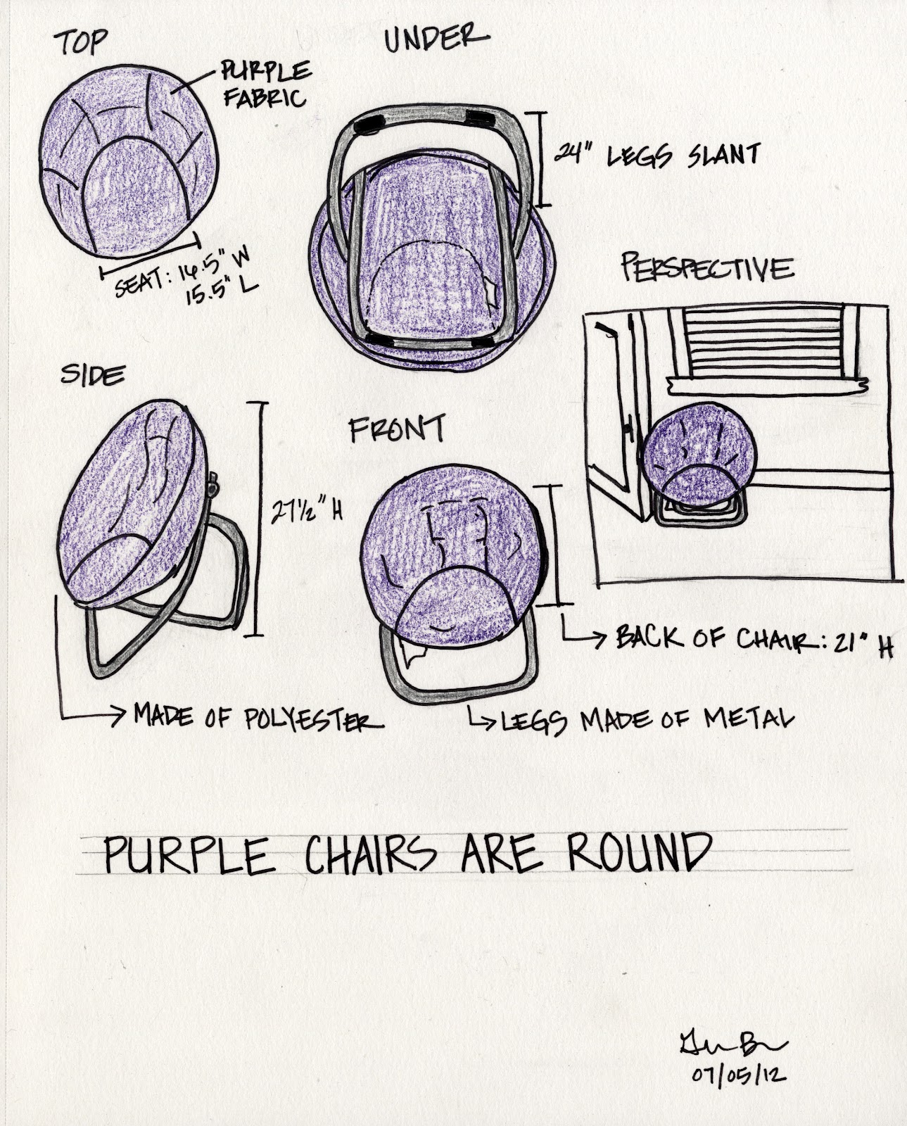
I sketched a round chair that was in my apartment. The seat is made of a polyester, purple material.The legs of the chair are made of metal. It can fold to be put away. I drew the plan, elevation, underside, back, and perspective of the chair.
Thursday, July 5, 2012
Top Three Abstractions


These are the three abstractions I chose to evolve into a three dimensional space. I will use these abstractions to create study models.
Tuesday, July 3, 2012
Simple Fruit

I used paint to shade and make different tones for a still life of some fruit. After I used the shades of color with the paint I used a flair pen and drew the contours of the fruit. I then added a background for color.
Monday, July 2, 2012
Photoshop Pattern

Here is a pattern I created on Photoshop using an analogous color scheme. An analogous color scheme is when there are colors that are adjacent to each other on the color wheel. I chose to use orange, yellow, and green as my scheme. Above is the gray scale version of my pattern which can be compared to the color version (below). The patterns were created by manipulating images in Photoshop and then cut into a pattern that I chose.

Subscribe to:
Posts (Atom)