Here is a little bit of free handed drafting to describe my experience while learning how to draw perspectives and contours and the many other methods I need to practice to become a successful designer. I don't free hand very often so my hand was shaking when I was producing the strokes but over all I just need to stay consistent to make it look uniform.
"To push the boundaries, you need to know where the edges are." - Mark Boulton
Thursday, July 26, 2012
"A Skewed Alternative"
Here are the final posters related to my work focusing on creating a 3-D space from a 2-D abstraction. The hand-crafted posters display my object of inspiration that I took an element from and expanded it to a structure with a purpose of sheltering and seating people. Studying how people would interact with the space gave me a good understanding of how to arrange and organize my design ideas. I found it difficult to portray my process and ideas on posters but I managed to display an adequate amount of information to get the concept across. Using an architect and found object to base my design on was interesting. I got to see how unrelated subjects can be connected and morphed into a brand new idea. I was striving to create a more organic shape to my design but ended up going in the opposite direction with geometric patterns. Sometimes things don't go as planned when designing but that opens up new paths to something never thought of. I am happy with the contrasted design that I resulted with and am glad I can pull out many elements and principles along the process to the end.
Friday, July 20, 2012
Final Seat and Shelter Model
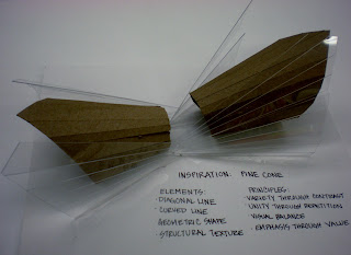
Here are some different angles of my final model that will act as a seat and shelter. The design was based off of my found object (a pine cone) and inspired from the designer I researched (Richard Meier). I used chipboard and acrylic in my model. I played with value, diagonal lines, geometric shape, and repetition to create an effective space to occupy.
Concept Model
This is the concept model I produced from my 2-D abstraction process and other refined study models. It is based off of a pine cone. This 3-D model will guide me to designing an actual space people can occupy.
Three Refined Study Models
Here are the three refined study models I created from my first bunch of models. The three were based off of certain characteristics I wanted to emphasis spatially. From these models I will focus on a concept to expand my design and gradually create a structure that can be used.
Thursday, July 19, 2012
An Other Two Point Perspective
Here is an other sketch using two point perspective. This time I practiced using an exterior view rather than an interior one. I feel that I am gradually getting better at understanding how the human eye recognizes space and it is becoming easier to quickly draw such a perspective.
Two Point Corner
I am working on drawing in a two point perspective right now. I find two point a bit easier to understand that the one point. I have had more successful sketches using this method. Here is an interior corner of a building on campus to display my practice using two point perspective.
Friday, July 13, 2012
Exterior One Point Perspective
I have been working on my perspective drawings lately. This is a one point perspective sketch of one of our engineering buildings on campus. I have difficulty drawing perspectives so I have been paying close attention to my horizon line and vanishing point. The left wall of the building was the most challenging for me since it is the part of the drawing that is in most perspective. The windows started out looking warped but I managed to make the lines more vertical to match the corner to make it look more realistic.
Tuesday, July 10, 2012
Abstraction Study Models
I created some study models based on my abstractions that I sketched and posted earlier to this blog. I went from the 2 dimensional sketches to these 3 dimensional models. Using the concepts I based my models on I will now refine my ideas to constructing a structural element that can be used by individuals.
Monday, July 9, 2012
Hybrid Drawing
I used photoshop to create a perspective sketch. Here are the grayscale and color versions of my room that I created.
Friday, July 6, 2012
Chair Perspective
I sketched a round chair that was in my apartment. The seat is made of a polyester, purple material.The legs of the chair are made of metal. It can fold to be put away. I drew the plan, elevation, underside, back, and perspective of the chair.
Thursday, July 5, 2012
Top Three Abstractions
These are the three abstractions I chose to evolve into a three dimensional space. I will use these abstractions to create study models.
Tuesday, July 3, 2012
Simple Fruit
I used paint to shade and make different tones for a still life of some fruit. After I used the shades of color with the paint I used a flair pen and drew the contours of the fruit. I then added a background for color.
Monday, July 2, 2012
Photoshop Pattern
Here is a pattern I created on Photoshop using an analogous color scheme. An analogous color scheme is when there are colors that are adjacent to each other on the color wheel. I chose to use orange, yellow, and green as my scheme. Above is the gray scale version of my pattern which can be compared to the color version (below). The patterns were created by manipulating images in Photoshop and then cut into a pattern that I chose.
Subscribe to:
Comments (Atom)


